Have you ever stopped to wonder why Ferrari features a horse on its logo, or what the three ovals that make up Toyota’s logo symbolize?
There’s no denying that these logos are all as iconic as the automakers they represent. However, being able to recognize a car’s manufacturer by logo isn’t the same as knowing what the symbol embodies.
Let’s look into the origins of some of the most iconic car logos today.
Audi
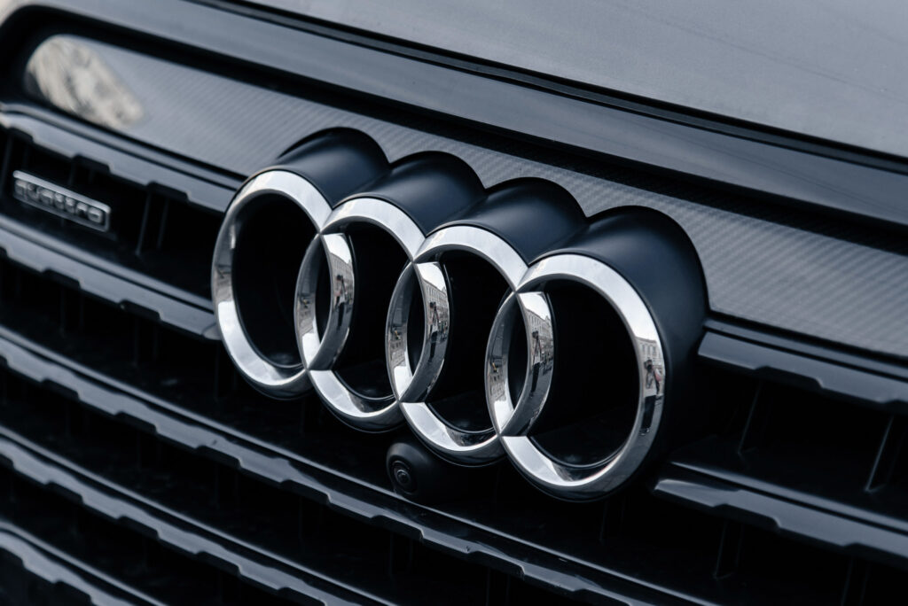
There’s more to these four rings than meets the eye. In the 1900s, four different manufacturers merged to create Auto Union AG, the company that would eventually become Audi AG. These companies were DKW, Horch, Wanderer, and of course, Audi itself.
The four rings represent the four companies, and each ring embodies a different core value. DKW embodies ingenuity, Horch signifies luxury, Wanderer represents exploration, and Audi embodies innovation.
BMW

Despite what many people say, the iconic blue-and-white logo of car manufacturer BMW doesn’t represent a spinning propeller. Instead, the logo is meant to represent Bavaria, the state in which BMW was founded.
Bavaria’s state flags feature white and blue colors, which BMW honored in its logo.
Chevrolet
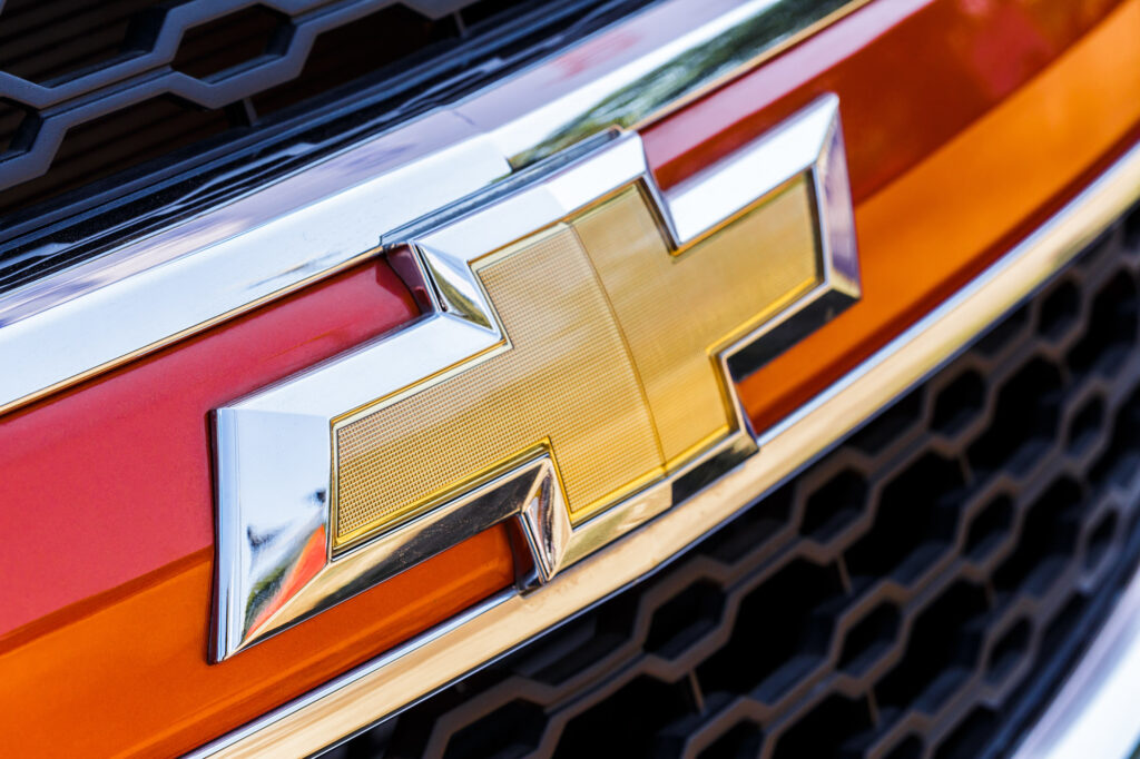
It’s said that the Chevrolet logo came to be when William C. Durant, co-founder of Chevrolet, was inspired by a design he saw on the wallpaper of his hotel room in Paris.
He liked the design so much that he ripped some of the wallpaper off the walls to take home. Later, the design would inspire him to make the iconic bowtie Chevrolet is known for today.
The bowtie comes in vibrant gold or yellow surrounded by a silver border. Some Chevys have a black bowtie though there’s no special meaning behind the change.
Ferrari
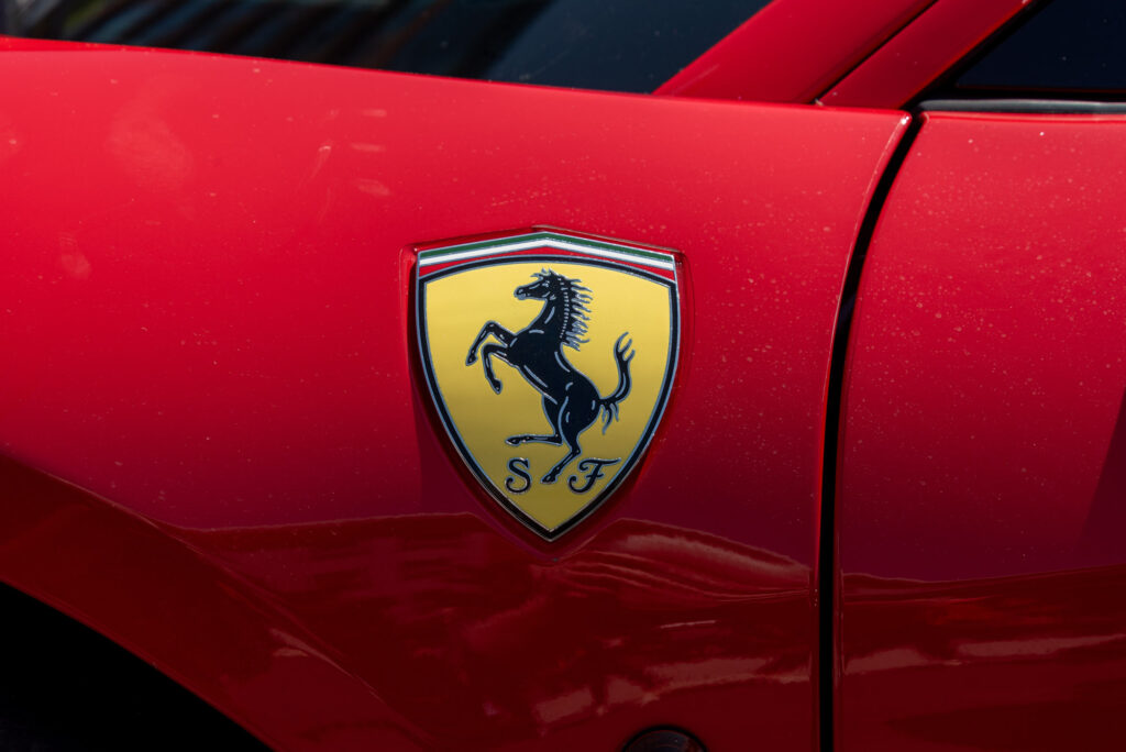
Ferrari is one of the most iconic luxury car manufacturers in the world, but how exactly did its logo come to be?
The “cavallino rampante” or prancing horse in the logo’s center came from Count Francesco Baracca, Italy’s top fighter ace during World War I. His plane had a black prancing horse painted on the side.
With permission from Baracca’s family, Enzo Ferrari, the founder of Ferrari, used the horse emblem for good luck.
The green, white, and red stripes atop the logo represent the colors of the Italian flag. As for the “SF” that appears at the bottom of the logo, the two letters stand for “Scuderia Ferrari” which is the name of the brand’s racing division.
Honda
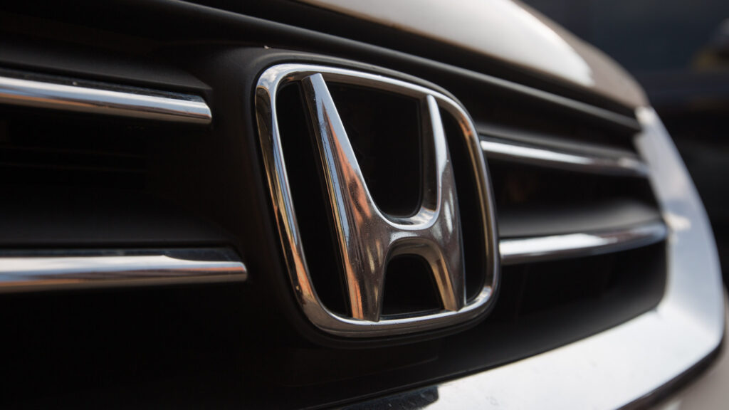
Honda Motor Company’s logo is simple: a stylized letter “H” encased in a border. The letter comes from the surname of the company’s founder, Soichiro Honda.
As for what the logo itself signifies, the symbol was designed to evoke innovation, quality, and reliability – all of which are qualities the company embodies with its vehicles.
Infiniti
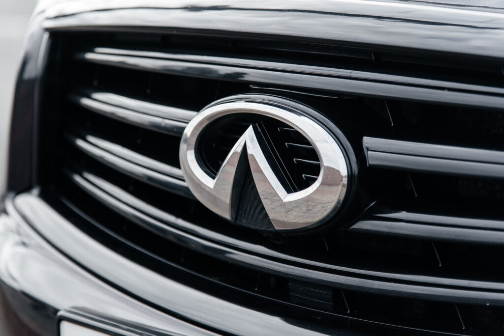
The Infiniti logo is a unique one, featuring an inverted V-like shape surrounded by a circular border. The shape could mean numerous things.
For example, the two lines connecting to create a triangular shape can be interpreted as a road stretching out over the horizon or a tall mountain. Many believe the logo pays homage to Infiniti’s beginnings in Japan by representing Mount Fuji, the country’s highest peak.
This design, coupled with its silver color scheme, evokes a sense of modernity and a push towards progress and innovation.
Lamborghini
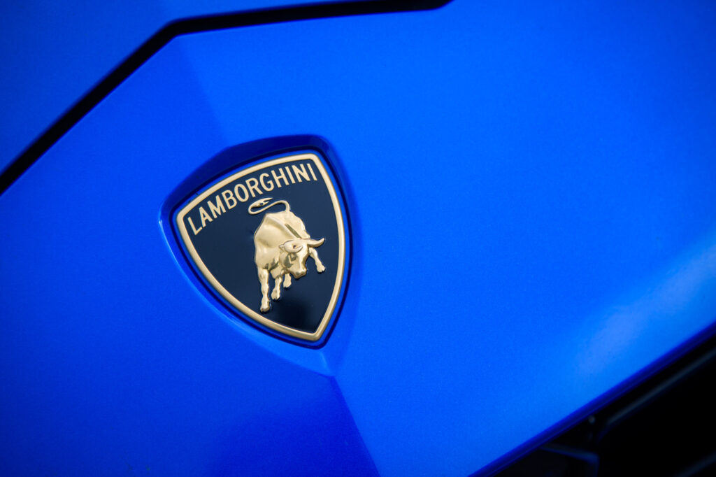
Lamborghini’s logo depicts a golden bull surrounded by a shield-shaped frame. The bull represents the qualities the world-renowned Italian car manufacturer values and instills in its vehicles: power, speed, and ferocity.
At the same time, the bull honors the heritage of the Lamborghini family, who were farmers before they became renowned for its vehicles. On top of that, founder Ferruccio Lamborghini also enjoyed watching bullfights.
Mercedes-Benz
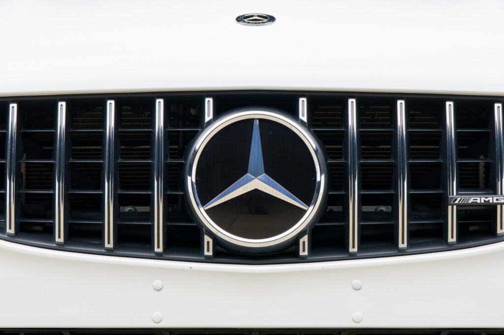
Who could miss the iconic Mercedes-Benz logo?
Characterized by a silver three-pointed star that anybody could spot from a distance, the logo represents the brand’s commitment to delivering top-tier engines on land, sea, and air. The brand also stuck with the metallic gray color to symbolize its suave and sophisticated image.
As remarkable as the logo is, the company had a few versions that changed over the years. The earliest version had a laurel wreath surrounding the “Benz” name at the center.
Porsche
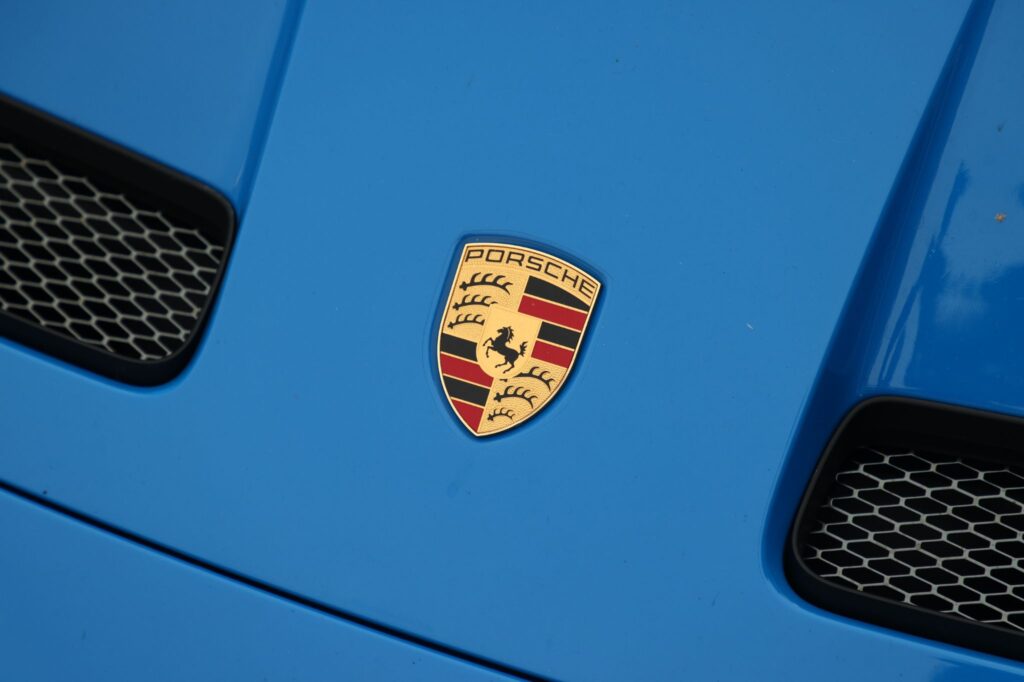
Porsche’s logo was inspired by the Stuttgart coat of arms, which translates to “stud garden” in English.
There are several versions as to how the logo came about. A popular belief is that Ferry Porsche drew the logo on a napkin, while others believe that it came from the idea of Porsche engineer Franz Xaver Reimspieb.
Rolls-Royce

A luxury brand such as Rolls-Royce stays true to its promise of delivering the best, including its logo.
The brand’s logo is hard not to recognize. You can easily spot the two Rs representing the company’s founders, but this detail isn’t the thing most people see at first glance.
The Rolls-Royce logo is accompanied by a small ornament on the hood of the brand’s models, which is actually a “Spirit of Ecstasy” figurine.
Subaru
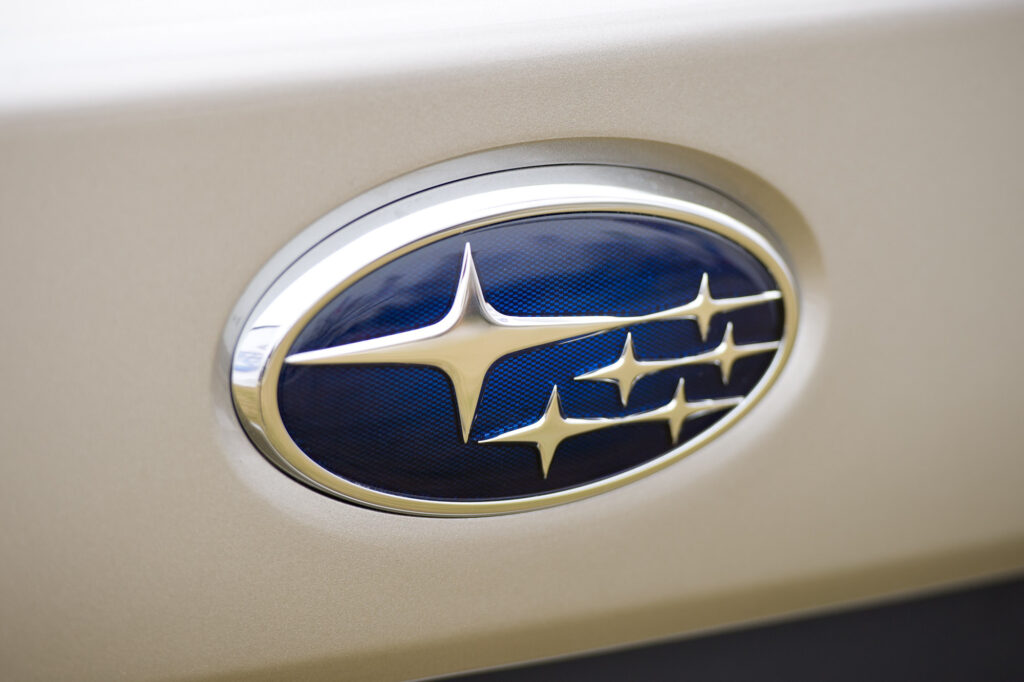
Another iconic car manufacturer with a logo that’s easy to recognize is Subaru with its six silver stars on blue. One of the stars is larger than the rest.
The logo represents the Pleiades, the group of stars that make up the Taurus constellation. The name “Subaru” is the Japanese translation for Pleiades.
Toyota
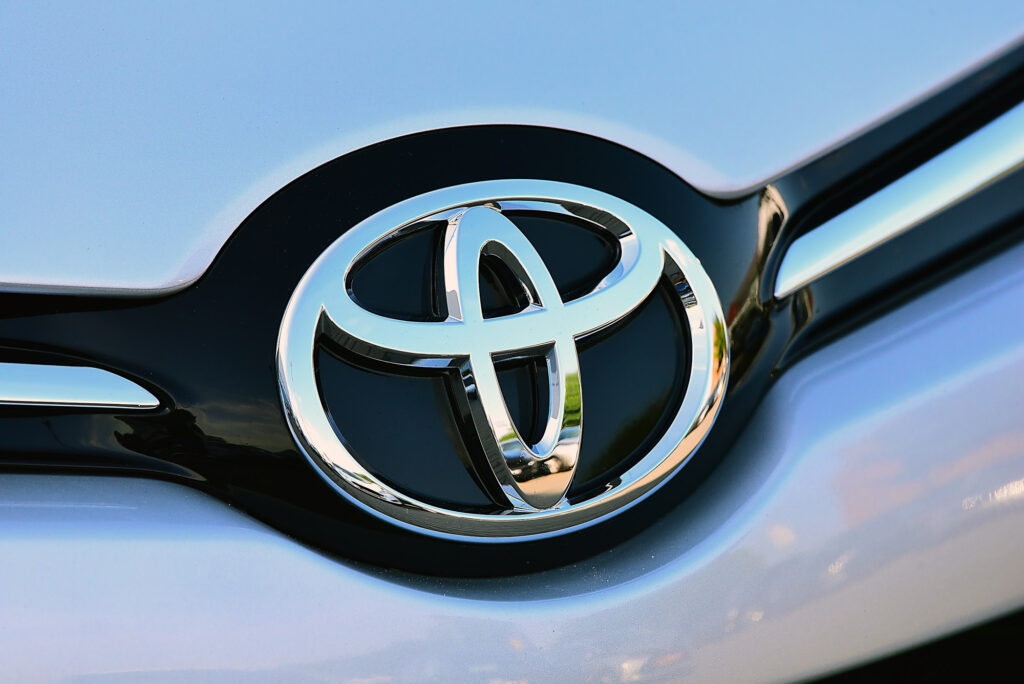
Japanese car manufacturer Toyota features two overlapping ovals encased by a significantly larger oval, creating a shape reminiscent of a T.
The two ovals in the middle of the logo represent the customer and the company, and the overlap represents the relationship and trust between the two. The larger oval that encompasses the two smaller ones represents the world and how it embraces Toyota.
As for the space inside the logo, the background embodies the different values of the company. These include quality, value beyond expectation, the joy of driving, innovation, and integrity in safety, the environment, and social responsibility.
Volkswagen
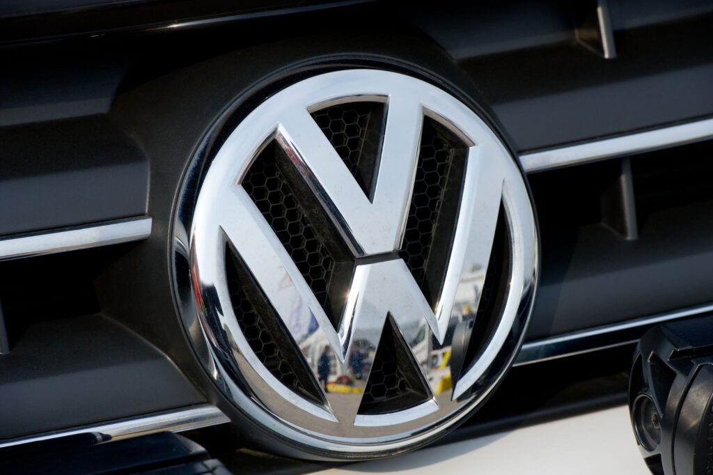
Volkswagen cars are already worthy of attention, but the blue emblem certainly takes the automaker’s vehicles to a whole new level.
There’s some debate as to who designed the brand’s logo, with some believing that Porsche’s Franz Xaver was the one who designed it. Others claimed that it was the work of Martin Freyer.
Either way, the small “v” sitting on top of the slightly bigger “w” is hard to miss when you’re logo spotting. The logo also adds a bit of charm to the brand’s unique vehicles.
Volvo
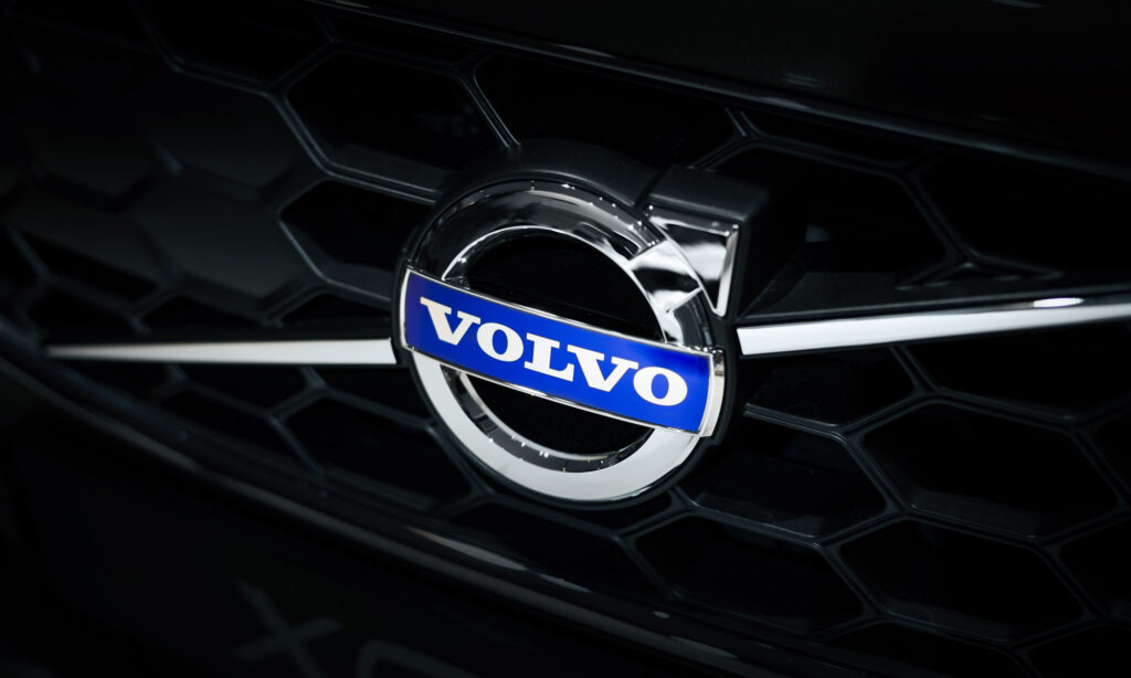
The symbol of a circle with an arrow pointing northeast is associated with manhood and masculinity. However, Swedish car manufacturer Volvo chose this symbol to represent it for a different reason.
The symbol’s association with Mars, the Roman God of War, and by extension its association with the metal iron, made it the perfect choice to represent Volvo. The sign also pays homage to one of Sweden’s most valuable products in the industrial age: iron.

Any information provided on this Website is for informational purposes only and is not intended to replace consultation with a professional mechanic. The accuracy and timeliness of the information may change from the time of publication.


